General info about the app
This app has a 'double view' design for visualizing either in 'general' (monasteries)
or 'detailed' (books) view. By default, the app is set to 'general' view but you can
always change your option by switching the 'Change view' button.
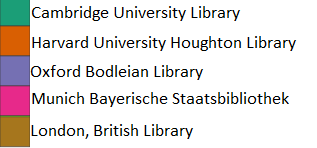
Colour coding is also a core concept in this app. As shown below, each color represents
a specific destination (library), this together with the marking of monasteries and libraries
can give the user a more intuitive view of the relation between provenance and destination.

There is a navigation bar at the top of every page of this app, clicking on the BookTracker or
the book logo will lead you to the main app page. Research view is a more sophisticated version
of the main app, with additional mini-maps, it can provide you a more precise view of the
monastery distribution. The graphs view is where you forget about the map and focus on comparing
the data, by religious order or destination.